UX Case Study
Pizza Trio Website Design
Problem statement
With the presence of big chain pizza storefronts like Pizza Hut and Papa Johns, how can Pizza Trio compete with other online presences that transcend online order-to-door drop-off?
Project goals
Create an easier experience to enable customers to decide, order, track and stay informed on their food orders.
Refresh the visual design and taxonomy of Pizza trio’s web experience to all for quick decision making.
Allow customers to express their positive experiences through reviews to help build company reputation.
Elevate monthly specials that Pizza Trio has to offer.
Approach
Discovery
Working through this project there were 3 big opportunities that emerged pretty early that most of us could consider being quick wins that the web experience was not taking advantage of.
The specials
These were monthly specials that the restaurant was running.
They were being promoted in the restaurant and over the phone when a customer would call to order but were not being surfaced on the site.
Specials were very popular and made up 23.6% of the restaurant’s revenue.
Outdated menu on the website that did not include newer menu options and only supported older menu items
Zero ability to track a delivery order.
Personas
The regular
Loyal customers in the area eat on average 4-5 times monthly at the restaurant. Most of their experiences eating the restaurant’s food are spent inside the establishment and not delivery. Would be likely to order delivery and eat the restaurant’s food if they could order specials online and if the online menu was the same as it was inside the restaurant.
The last-minute dinner solutioner
Customers that know of the restaurant but have other options to order from. They like the food but are looking for convenience when ordering and struggle with Pizza Trio’s online experience since most mom and pop places don’t have order tracking.
“I would probably eat at Pizza Trio’s more often if it was easier to order online. When we decide on them we end having to call because their online ordering is kind of confusing.”
Gleaned opportunities
Create an online order tracking system for the ‘the last minute dinner solutioners’ that can keep them informed throughout the journey of their order.
Add an updated menu and surface monthly specials for ‘the regulars’ to keep them coming and enjoying Pizza Trio’s amazing food.
The Solution
Giving them their favorites
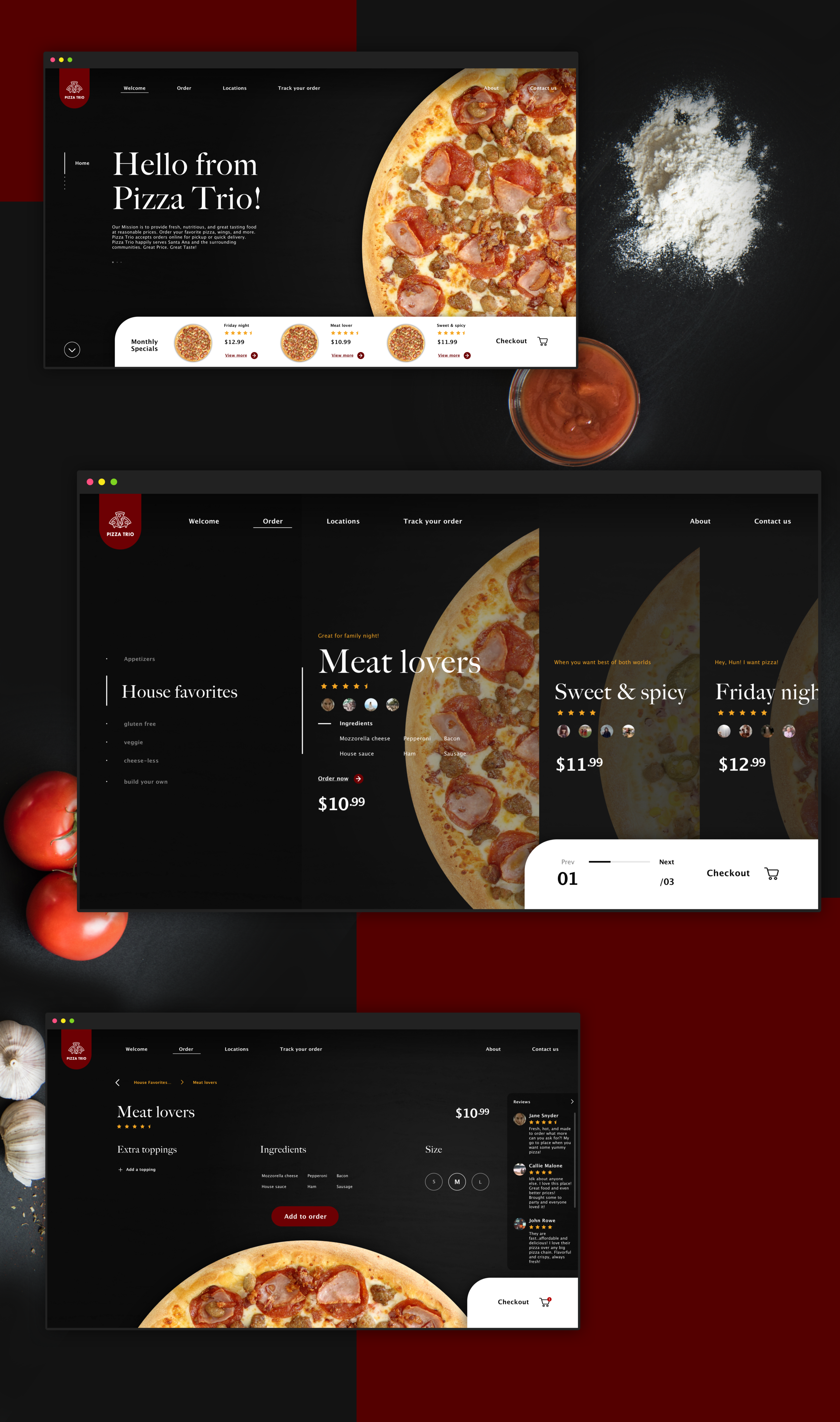
Adding monthly specials to the home page right near the checkout, brought the customers their favorites from the restaurant to the landing screen.
Updated Menu
Updated the menu and gave the users an easier taxonomy to discover menu items that they love. We also added reviews to the website letting loyal customers boast about their favorite foods.
Adding suggestions
Adding suggestions on checkout that go great with the food they have already selected was a fantastic way to build out customer orders and earn the business more revenue.
ORder tracking
Letting the customer enroll in message updates through the web browser let the customer know where their order was in the delivery life cycle and let them track their orders after the food had left the restaurant.
In Conclusion
This project was one of the more difficult ones I have been a part of. Dealing with a lack of communication with the client drove a lack of understanding of customer needs which led to the first iterations of the design to fail at the beginning of the project. After the design team was able to sit down with the restaurant’s customers, it was then we were able to produce positive performing designs that began to solve customer problems. Once we were able to practice user-centered design we were able to produce real solutions. This was an eye-opening experience and just solidified that user-centered design should be the only way to design digital experiences.


